
Toyota trades at 8.5 times trailing earnings. Ferrari trades at 39.4. Tesla trades at 337.3. All three sit in the same industry group, and the group’s average P/E is 52.4, which describes none of them.
That is the catch with any map of industry multiples, including the one below. We took the average trailing P/E for each of the 30 industry groups where StockVane covers at least three stocks. They run from auto manufacturers at 52.4 times earnings to property and casualty insurers at 9.7, a spread of 5.4 to 1. My argument is that the map is worth having as long as you read each average together with the stocks behind it. Where the two disagree, the group is telling you about one or two outliers and not about the industry.
How the map was built
The industry average comes from the valuation data behind each StockVane quote page, which averages trailing P/E across the stocks the data provider files under that industry. For each group I also pulled the trailing P/E of every stock we cover in it, from the September 2026 snapshot, and took the median of the positive ones. Two numbers per group, then: the feed’s average, and the median of our own coverage.
They can differ for a plain reason. The feed counts stocks we do not cover. The semiconductor average of 32.6 is built on 40 names in the feed, while we hold 12. Regional banks are the extreme case: the feed’s 305 banks produce an average of 12.7, and our four (ICICI Bank, Mizuho, Nu Holdings and Truist) have a median of 17.5. Neither number is wrong. They answer different questions, and I will use both.
One more filter. Groups with fewer than three stocks in our coverage are dropped, so thinly covered industries are not on the map.
The richest groups
| Industry group | Average P/E (valuation feed) | Stocks we cover | Median P/E of covered stocks |
|---|---|---|---|
| Auto Manufacturers | 52.4 | 3 | 39.4 |
| Semiconductor Equipment & Materials | 45.1 | 4 | 49.2 |
| Aerospace & Defense | 32.9 | 6 | 27.8 |
| Semiconductors | 32.6 | 12 | 45.6 |
| Software – Infrastructure | 32.5 | 7 | 63.7 |
| Specialty Industrial Machinery | 30.2 | 5 | 27.2 |
| Drug Manufacturers – General | 30.1 | 8 | 24.9 |
| Computer Hardware | 28.7 | 4 | 47.4 |
| Medical Devices | 26.3 | 4 | 25.6 |
| Software – Application | 25.9 | 11 | 26.1 |
Technology and industrial equipment fill the top of the ranking. Auto makers lead on the strength of one stock, and the next two groups, semiconductor equipment at 45.1 and aerospace and defense at 32.9, are more typical. A dollar of earnings in the top group costs about $52; in the cheapest it costs about $9.7. Flip the ratio and it reads as an earnings yield: 1.9% at the top against 10.3% at the bottom.
When the average lies
Start with autos, since it is first on the list. Tesla’s market value is about 83% of the three auto makers’ combined value, and its P/E of 337.3 drags the simple average up. The median of the three is 39.4, and the one that anchors the low end is Toyota at 8.5. Anyone buying a car company because the group looks expensive, or looks cheap, is really making a bet on which of those three they own.
Software infrastructure is the same problem in a louder key. The feed’s average is 32.5. Our seven names include CrowdStrike at 6,254 times earnings and Palo Alto Networks at 909, which suggests very small trailing profits, plus Cloudflare, which has negative earnings and so drops out of the median. What is left has a median of 63.7. Meanwhile Microsoft sits at 27.5 and Oracle at 23.1, well under the group average. If you compare Oracle with “software” you conclude it is cheap. If you compare it with Microsoft, the gap is only four turns. Our Oracle backlog piece is about whether that multiple is earned, and the answer depends on which comparison you accept.
Semiconductors go the other way: the feed says 32.6, our twelve have a median of 45.6. The large chip stocks we cover are more expensive than the industry as a whole, which is what you would expect if the wider group has plenty of slower, older-technology names. I read that as a warning to anyone who quotes the 32.6 as if it applied to the stocks people actually buy. For a look at one of the richest names in this neighborhood, see our ASML forecast.
Some groups behave. Aerospace and defense averages 32.9 in the feed and 27.8 across our 6 stocks. Large drug makers average 30.1 against a covered median of 24.9, with 8 names of ours behind it, and medical devices land at 26.3 against 25.6. In these three the two measures are within about six turns of each other, so the group label is a usable yardstick. Railroads, at 25.1 on three stocks, are similar. That is a short list, and it is the honest answer to the question of where an industry average can stand in for a benchmark: mostly in businesses where no single company dominates the earnings.
The pattern deserves a caveat. Three or four stocks is a small sample even when the two numbers agree, and agreement between an average and a median only rules out one kind of distortion. It cannot rule out that the whole group is priced for a story that is about to change.
The cheapest groups
| Industry group | Average P/E (valuation feed) | Stocks we cover | Median P/E of covered stocks |
|---|---|---|---|
| Insurance – Property & Casualty | 9.7 | 3 | 10.1 |
| Telecom Services | 10.6 | 4 | 10.5 |
| Banks – Regional | 12.7 | 4 | 17.5 |
| Oil & Gas Integrated | 12.8 | 6 | 12.0 |
| Oil & Gas E&P | 13.1 | 4 | 11.8 |
| Banks – Diversified | 14.7 | 14 | 14.8 |
| Oil & Gas Refining & Marketing | 14.9 | 3 | 15.6 |
| Oil & Gas Midstream | 16.4 | 7 | 20.5 |
| Utilities – Regulated Electric | 16.5 | 5 | 20.6 |
| Capital Markets | 17.6 | 5 | 19.2 |
Insurance, telecom, banks and oil fill the bottom. Property and casualty insurers average 9.7 in a feed that covers 40 names. Our three are Allstate at 5.0, Travelers at 10.1 and Progressive at 10.7, so the low average is not one stock’s doing. Telecom averages 10.6: Comcast 7.3, AT&T 8.4, Verizon 12.5.
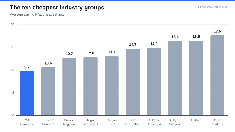
Why are these cheap? The usual explanation is that these are mature businesses with earnings that do not grow fast, and the market pays less for a dollar it does not expect to expand. I think that is right for telecom. For insurers I am less sure, because earnings in that industry depend heavily on how many catastrophes a given year brings, and a trailing P/E taken at a good stretch can look low exactly when the next stretch is about to be worse. Our data does not tell me which. It only tells me that a low multiple in this group is a starting question, not a discount.
The same warning applies to oil. Integrated producers average 12.8 and exploration and production companies 13.1, and commodity earnings are at their most flattering to a trailing multiple when prices have been high. For a stock in that group, Exxon’s forecast argues the driver is capital discipline and not the oil price, which is a reason to look past the multiple.
The middle of the map
The median of the 30 averages is 20.7. Twelve groups sit at 25 or above and seven sit below 15, so the distribution is lopsided: a small cluster of expensive groups pulls the top, and the bottom is a tight bunch of financials, energy and telecom. Utilities sit just under the middle: regulated electric averages 16.5, which suggests investors treat them more as bond substitutes than as growth stories. For one utility that people do pay up for, the NextEra piece goes through it.
Banks deserve their own line. Diversified banks average 14.7 across 14 of our stocks, and every one of the fourteen has a positive P/E, which makes it the most reliable average on the whole map. Our JPMorgan record-high piece argues about what you are paying for at roughly 15 times earnings, and this table says why the argument is a fair one: 15 is right at the group’s average, not a premium to it.
How I would use it
Put a stock’s own P/E next to its group’s, in that order, and do it before looking at the market multiple. A stock at 30 in a group that averages 32 is a different proposition from a stock at 30 in a group that averages 13. The first is ordinary. The second needs a reason, and that reason is usually growth you can name in numbers.
Then check the median. When the median and the average are far apart, as in software infrastructure (32.5 against 63.7) or regional banks (12.7 against 17.5), the group label is not a benchmark. Use two or three direct peers instead.
A worked example makes the routine concrete. Take Tesla against its group: 337 against a group average of 52.4, so it looks only somewhat expensive. Take it against the median of 39.4, or against Toyota at 8.5, and the same stock looks like an outlier by a factor of eight or more. The routine costs about a minute per stock and it changes the conclusion more often than you would expect. I would rather have that minute spent here than on the market-wide P/E, which averages away exactly the differences this map exists to show.
What this map cannot do is say whether any of these multiples is too high. A group at 52 times earnings can be fairly priced if its profits double, and a group at 10 can be a trap if they fall by half. Growth rates, margins and balance sheets sit outside this screen, and I have not tried to fold them in.
The group I would recheck in November
Autos. With Toyota at 8.5 and Ferrari at 39.4, Tesla would have to fall below about 72 times earnings for the three-stock average to drop under 40. It is at 337 now, so that needs either a large rise in Tesla’s trailing profit or a much lower share price. Until one of those happens, the map’s most expensive group is really one stock, and the number worth watching is Tesla’s next reported earnings per share.
Financial disclaimer: The content on StockVane is for educational and informational purposes only and should not be construed as professional financial advice. Stock market investing involves risk of loss.
Sources: Dividends (SEC Investor.gov glossary) (https://www.investor.gov/introduction-investing/investing-basics/glossary/dividend) · Price-to-earnings ratio (SEC Investor.gov glossary) (https://www.investor.gov/introduction-investing/investing-basics/glossary/price-earnings-pe-ratio)