
It takes the 83 smallest stocks on our list to add up to the value of NVIDIA alone. NVIDIA is worth $5.36T. The 83 companies at the bottom, a group that includes household names most investors would call large, together just about match it.
That is the shape of the 295 stocks with a reported market value among the 300 we cover. Together they are worth about $80 trillion, and the ten largest lines account for 40.3% of it. My argument in this piece is that the concentration is real, that it is a little smaller than the raw data shows once share classes are handled properly, and that it makes the average stock’s experience differ sharply from the index headline. Every number below comes from the StockVane quote snapshot as of September 18, 2026.
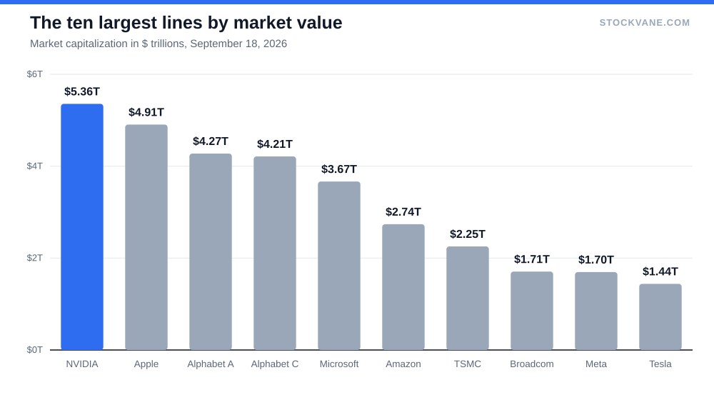
How the weight is distributed
Start with the ladder. The single largest stock carries 6.7% of the total. The top 5 carry 28.0%, the top 10 carry 40.3%, the top 20 carry 51.7% and the top 50 carry 65.6%. By the hundredth name we are at 78.4%, and by the 150th at 86.2%.
Read the other direction and the picture gets starker. Ranks 51 to 150 add 20.6% of the value. The remaining 145 stocks, half the list by count, add 13.8%. If you held every stock in equal dollar amounts, the ten largest would be 3.4% of the portfolio. In a cap-weighted portfolio they are 40.3%, roughly 12 times the equal-weight share.
The median company in the group is worth about $106 billion. That is a big company by any normal standard. Being the median here means sitting at roughly 2% of NVIDIA’s value, and it is why “large-cap” stopped describing a single kind of stock some time ago.
The top 15, and a data caveat
The table shows the fifteen largest lines with their share of the total, the running share and two quick reads: the trailing P/E and the distance below the 52-week high.
| Rank | Company | Market cap | Share of total | Cumulative share | Trailing P/E | Vs 52-week high |
|---|---|---|---|---|---|---|
| 1 | NVIDIA | $5.36T | 6.7% | 6.7% | 28.1 | -6% |
| 2 | Apple | $4.91T | 6.1% | 12.8% | 38.5 | -2% |
| 3 | Alphabet-A | $4.27T | 5.3% | 18.2% | 17.5 | -14% |
| 4 | Alphabet-C | $4.21T | 5.3% | 23.4% | 17.3 | -15% |
| 5 | Microsoft | $3.67T | 4.6% | 28.0% | 27.5 | -10% |
| 6 | Amazon | $2.74T | 3.4% | 31.4% | 20.4 | -12% |
| 7 | Taiwan Semiconductor | $2.25T | 2.8% | 34.2% | 32.4 | -9% |
| 8 | Broadcom | $1.71T | 2.1% | 36.4% | 45.6 | -28% |
| 9 | Meta Platforms | $1.70T | 2.1% | 38.5% | 25.1 | -15% |
| 10 | Tesla | $1.44T | 1.8% | 40.3% | 337.3 | -27% |
| 11 | Micron Technology | $1.15T | 1.4% | 41.7% | 23.0 | -19% |
| 12 | Berkshire Hathaway-B | $1.09T | 1.4% | 43.1% | 12.8 | -5% |
| 13 | Berkshire Hathaway-A | $1.09T | 1.4% | 44.4% | 12.8 | -5% |
| 14 | Eli Lilly and Co | $1.09T | 1.4% | 45.8% | 38.7 | -11% |
| 15 | JPMorgan | $0.93T | 1.2% | 47.0% | 15.0 | -5% |
14 lines are worth more than $1 trillion each. Look closely, though, and two of them need a caution. Alphabet appears twice, as class A at $4.27 trillion and class C at $4.21 trillion. Berkshire Hathaway appears twice as well, with $1.09 trillion on each of its A and B lines. The pattern of near-identical values suggests each line is priced as the whole company, meaning the class price times total shares outstanding. I read this as double counting, and a company cannot be worth $8.5 trillion when its class A and class C lines each carry roughly half of that figure already.
I did not adjust the headline numbers, since the feed does not say how it computes them. The adjustment is easy to test, though. Drop the class C line and Berkshire’s A line, and the list becomes 293 companies worth $74.7 trillion. The top ten’s share falls from 40.3% to 39.0%. The story barely changes, which is the point: the concentration does not depend on the double count.
Ten stocks, one trade
What do the top ten have in common? The ten lines are nine companies, and seven of those are tied to the AI build-out in one way or another, through chips (NVIDIA, TSMC, Broadcom), cloud and software (Microsoft, Alphabet, Amazon) or advertising (Meta) and the other two are Apple and Tesla, which are consumer hardware businesses with different drivers. That is my grouping, and I would not defend it to the decimal. Still, when a handful of companies depend on the same spending wave, the top of the index behaves like a single position more often than the count of tickers implies. Our look at AI infrastructure stocks covers who is on the receiving end of that spending.
Valuation matters here too. The median trailing P/E of the top ten is 27.8, against 22.8 for the other stocks with positive earnings. The premium is modest. Tesla, with a trailing P/E of 337, pulls the individual reading up in a way that the median hides, and only four of the ten trade above 30 times earnings. The stocks do not look like a bubble on that gauge. They look like companies priced for growth that keep delivering it.
Distance from the high is about the same for the top ten and everyone else: the median top-ten stock sits roughly 13% below its 52-week high, and the median of the rest roughly 13% below. Both groups have pulled back to a similar degree. So the top of the list is not richer than the rest, and it has not been hit harder or less hard either.
What concentration means for someone owning an index fund
A cap-weighted fund holds these weights by construction. When the ten largest names rise 10% and the other 285 stay flat, the fund gains about 4%. If the ten fall 10% and the rest are flat, the fund loses about 4%. An equal-weight investor would see a 0.3% swing on the same news, because ten stocks are 3.4% of the portfolio.
That asymmetry cuts both ways. In a market led by a few winners, cap-weighting has been the better place to be. In a market where leadership rotates, it is the worse one, because you are forced to own more of what already rose. I am not predicting rotation. I am saying the fund you own has a bet in it, and it is a bet you can size.
There is a middle path. Hold a cap-weighted core and give a smaller slice to the parts of the market outside the top 50, which account for 34.4% of value in this list. Our piece on semiconductor stocks beyond NVIDIA is one example of thinking beyond the biggest name, and the Q4 tech list does the same for the wider sector.
What I am not covering here is sector composition across the entire list, or the weights in any specific index. The snapshot does not classify every stock consistently, and index rules differ, so I would be guessing.
Why the ordering can change
Rankings here are a snapshot, and they are less stable than the tidy ladder suggests. A 10% move in the fifth-largest stock shifts about 0.46 percentage points of the total, which is more than the entire weight of the 200th name. Several stocks in the top 15 sit within a few percent of their neighbors, so a single weak quarter can reorder the table without changing the concentration figure much. The share held by the top ten is far steadier than the identity of the ten.
The half of the list that barely moves the total
Look at what sits below the top 50. The 50th-largest stock is worth about $270 billion. The 150th is worth $105 billion. The smallest on the list, Interactive Brokers, is worth $41 billion. Every one of these is a company most people would call substantial, and the largest single stock is roughly 130 times the smallest.
That spread has a practical consequence for anyone who screens stocks by valuation or growth. A screen returns names in proportion to their count, not their weight. If you pull the cheapest 30 stocks on the list, you will mostly get names from the bottom half, and the result barely resembles the index. Conversely, if you look only at the largest 10 for signals about the market, you are reading 40% of the value and about 3% of the count. Neither view is wrong. They answer different questions, and mixing them is how a portfolio ends up matching the index in headline and diverging in every way that matters.
I use a simple check when I compare a stock with its peers: is the comparison to the group by weight or by count? Our win-rate-first portfolio took a different route, picking on odds instead of size. A stock that trades at 20 times earnings against a “market” multiple of 27 looks cheap if the market means the top ten and ordinary if it means the median company, which trades at 23. Our note on how I pick stocks starts from that question.
The share I would watch for the top ten
Two thresholds tell you whether the concentration is getting worse. First, the top-ten share of 40.3% on this list. If it moves above 42% while the number of stocks stays the same, the market is leaning harder on a few names. If it drops below 38%, leadership is broadening, and equal-weight portfolios should start catching up.
Second, watch the ratio of top-ten P/E to everyone else. Today that is 27.8 against 22.8, a gap of about 5 points. A gap that widens past 10 points would tell me the market is paying more for the same concentration, and that is when the bet in the fund gets expensive.
Financial disclaimer: The content on StockVane is for educational and informational purposes only and should not be construed as professional financial advice. Stock market investing involves risk of loss.
Sources: Price-to-earnings ratio (SEC Investor.gov glossary) (https://www.investor.gov/introduction-investing/investing-basics/glossary/price-earnings-pe-ratio) · Market capitalization (SEC Investor.gov glossary) (https://www.investor.gov/introduction-investing/investing-basics/glossary/market-capitalization)