
Over the last 20 trading days the ten largest US stocks rose 4.5% on average. The median stock among the 300 StockVane covers fell 2.5%. If you only looked at an index headline this month, you saw the first number and missed the second.
Price answers what happened. Flow, breadth and positioning answer who did it and whether they will keep doing it. That is the whole method, and it is the reason I keep a short weekly checklist, part of the process in how I pick stocks, instead of a view on next week’s direction. None of these numbers predicts a turn. They tell me whether the move in front of me has support underneath it.
I read four things, in a fixed order: order flow, breadth, concentration and options positioning. This piece runs the checklist on StockVane’s own data as of September 18, 2026, so you can see what a reading looks like and not only what a definition says. A note on scope: the data covers 300 US stocks and their options, so this is a read on large-cap stocks, not on total fund flows. I will say at the end what I could not measure here.
Order flow: who was buying
The first check is the direction of large-order money. Our database records net main-order flow per stock per day, the feed’s classification of large orders on the buy side minus the sell side. Add it over the 300 stocks and you get a measure of whether large holders were net buyers of this universe.
They have not been. Over the last 20 trading days the total was a net outflow of $12.9 billion, and each of the last eight weeks was negative, from $1.9 billion of net selling in the mildest week to $3.7 billion in the heaviest. On the most recent full day, 45.2% of stocks had positive main-order flow, against a summer average of 41.7% and a range from 33.4% to 52.5%. Note that the feed is complete only through September 11, so I stop the flow series there.
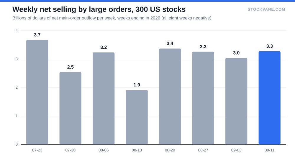
Selling that is steady for two months and never spikes reads differently from a one-day liquidation. It looks like rotation, or a slow reduction of exposure, and I read it as a headwind and not a signal. Prices did not fall in line with it, which brings up the second check.
One week of flow data proves very little, and one day proves nothing at all.
A caution about the flow series itself. Main-order flow is a classification, not a receipt: the feed sorts trades by size, so a large buyer working a position in small pieces will not show up as large. I use it to compare weeks against each other and against the other three checks, never as an absolute count of dollars. When the sign is negative for eight weeks running and the size barely moves, the pattern carries more information than any one figure in the series.
Breadth: how many stocks joined in
Order flow tells you money is leaving. Breadth tells you where it is leaving from. Of the 300 stocks, 66.7% closed September 18 above their own 200-day average, down from 83.3% on August 19. The 50-day version fell further, from 66.3% to 40.7%. On the last session, 113 stocks rose and 186 fell.
Longer-horizon breadth is still healthy. Two-thirds above the 200-day line is not a bear market. But a drop of 17 points in a month, with the shorter average falling faster, says the damage sits in the recent weeks and not in the trend. Only 13.7% of the 300 sit within 5% of their 52-week high, and 89 trade more than 20% under it.
I check breadth every week next to price because it is the one measure here that can disagree with an index while the index looks fine. Twenty days ago the two agreed. Now they do not.
Concentration: whose price is the index
The ten largest of the 300 stocks account for 40.3% of their combined market value of about $80 trillion. The largest single company is 6.7% by itself. When ten names carry two-fifths of the weight, an index level tells you mostly what those ten did.
| Group (20 trading days to September 18, 2026) | Average price change | Note |
|---|---|---|
| Ten largest stocks | +4.5% | 40.3% of combined market value |
| All 300, equal weight | -1.3% | Simple average of returns |
| Median stock | -2.5% | 99 of 300 rose |
That is what the opening numbers showed. The largest ten were up 4.5% over 20 days, the equal-weighted 300 were down 1.3%, and only 99 of 300 stocks finished higher. Concentration is not a problem while the leaders keep winning. It becomes one when they stop, since nothing beneath them is rising to fill the gap. Our looks at Microsoft’s AI spending and Alphabet’s valuation against other big tech go into what would have to change for the leaders themselves.
Flow tells the same story from another angle. Of the 300 stocks, only 84 had positive cumulative main-order flow over 20 days, and the ten biggest inflows made up 67% of all positive dollars. Only 4 of the ten largest companies were net buyers. NVDA led with about $1.24 billion, then TSLA at $0.98 billion and MSFT at $0.33 billion. The heaviest selling hit AVGO ($1.02 billion), CRM ($0.63 billion) and INTC ($0.60 billion).
Options: what the crowd is paying for
The put/call ratio is the fastest of my checks and the easiest to abuse. Heavy put buying relative to calls tends to cluster near lows, because it reflects fear. A low ratio reflects complacency. It works as a contrarian gauge only at extremes, and I never trade on a single print.
Across the 123,386 listed contracts in our database, puts hold 9.9 million in open interest against 11.9 million for calls, a ratio of 0.83. Traded volume in the latest data ran 2.8 million puts to 4.5 million calls, or 0.62. Both readings lean toward calls. These are single-stock options, so they run structurally lower than index puts bought as hedges, and I have no stored history to say where 0.62 sits in its own range. I would not call that fear or complacency from one snapshot. I would say that after a month in which breadth fell sharply, nobody was paying up for protection.
Why the order matters
I run the checks in the sequence above on purpose. Flow comes first because it is the slowest to change and the hardest to dismiss. Breadth second, because it tells me whether the flow reading is a broad exit or a narrow one. Concentration third: it decides whether an index chart means anything at all. Options last, because positioning moves in hours and is the check most likely to mislead me if I read it before the other three.
The order also protects against a habit I have had to unlearn, which is picking the signal that agrees with the position I already hold. If I look at the put/call ratio first and like it, I find reasons to skim the rest. Reading the slow measures first removes most of that temptation, and it forces the disagreements between signals into the open, which is where the useful information tends to be.
Reading them together
| Signal | What it measures | Reading on September 18, 2026 | How often I check |
|---|---|---|---|
| Order flow (main-order net, 300 stocks) | Whether large orders were net buyers | Net outflow of $12.9 billion over 20 days; 8 negative weeks in a row | Weekly |
| Breadth (share above 200-day average) | Whether gains are broad | 66.7%, down from 83.3% a month earlier | Weekly |
| Concentration (top ten weight) | Whose price the index really is | 40.3% of combined market value | Monthly |
| Options positioning (put/call) | How much protection traders are buying | 0.83 by open interest, 0.62 by volume | Daily, smoothed |
Order flow negative for eight straight weeks, breadth down 17 points in a month, ten stocks doing the lifting, and options traders leaning to calls. Each piece alone is ordinary. Together they describe a market that is narrower than its headline and not being defended by hedgers. That is a description of fragility, not a forecast. Markets can stay in this state for months while the leaders keep making money.
The Federal Reserve raised its target range on September 16, from 3.50% to 3.75% to 3.75% to 4.00%. Higher rates have historically been hard on the stocks that never took part in the leadership, and I read the breadth drop partly through that lens. Our note on the hike covers the rate side, and I would not attribute this month’s flow to it without evidence.
What I could not measure
Three things I check elsewhere are missing here. I have no weekly fund flow series, so I cannot separate money leaving equities from money moving between mutual funds and ETFs, a distinction that changes the sign of the conclusion. I have no margin debt data, a slow monthly gauge of borrowed money that I look at when a rally gets long. And the options data is a snapshot without history. Treat the flow reading above as one lens on 300 large stocks. Adding those two would be the first upgrade I make to this checklist.
The two numbers I would log on Friday
Write down two things every Friday: the share of stocks above their 200-day average and the 20-day return of the equal-weighted group against the top ten. Today they read 66.7% and -1.3% against 4.5%. If the first drops below 60% while the largest ten are still positive, I treat the rally as leadership only and cut the size of anything that is not a leader. If it climbs back above 75% with flow turning positive, I stop worrying about it.
Gavin Thorne has invested in U.S. stocks for six years and previously worked at a large publicly traded internet company. He writes about income-oriented strategies, including cash-secured puts, and about how he reads company data. This article reflects his personal research process and is for informational purposes only. It does not constitute investment advice.
Sources: Stock options tax topic (IRS) (https://www.irs.gov/taxtopics/tc427) · Federal Reserve monetary policy (https://www.federalreserve.gov/monetarypolicy.htm)